You are here
Redesign of the Conzultrix Website
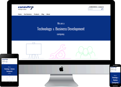
We recently launched the redesigned Conzultrix website and it was a cause for excitement as the old site was long overdue for an upgrade. For the new site we went for minimalism and responsiveness. Before I elaborate on what went into the sauce, a little background.
Background
The old site was launched in September 2009; which is a 1,000 technology year, considering the pace at which web technologies evolve. The home page had a fully interactive Flash application - with navigations, buttons, and other controls - yes, I did say it was 2009. We were pretty proud of the site then, until technology quickly rendered it obsolete. For one, Flash on the web is practically dead. With mobile traffic on the web raising the site wasn’t optimised for mobile in any way. It was a pain to navigate on mobile devices. The site was built with Drupal 6 which is like the Windows XP of Content Management Systems (CMS) in terms of its end of life status.
Nir Eyal talks about how hooked we are on our mobile gadgets and point to reports showing that we check our devices within 15 minutes of waking up every morning. Well for me make that 15 seconds. I do 95% of my content consumption on my mobile phone and if a site isn’t optimised for mobile, I just hit the back key and leave the site. So the Conzultrix site was one of those I couldn't use. For that reason, we had to elevate the issue of optimising the site to critical and make out time to rebuild it.
Preparation
We wanted a clean and simple site; one that had the least clutter. We wanted any information displayed to be relevant.
So in preparing for the project, we took out a few section to discuss our desired goals. Then as they say: “the best way to begin is to begin”, so begin we did.
The first step was to make free hand sketches of our ideas for the various pages. Then putting ideas from different people together, we made final sketches using printed out sketch sheets from the 960 grid system. We no longer use the 960 grid system but the sketch sheets are still very valuable as we actually design to the grid.
When we were satisfied with the sketches, we made wireframes using Balsamiq. If we were working with an external client this would be the first deliverable. The wireframe digitizes our sketches allowing us to make quick changes to areas we have thought out differently as we have further discussions.
After the wireframe, we then moved to a high fidelity prototype using Adobe Fireworks. This is where we add colours, buttons, and navigations, presenting the whole look and feel of the site. Some people do use Fireworks for both the wireframe and prototype, but I tend to prefer Balsamiq for wireframe as it is really simple for abstracting your ideas without the distraction of colours. It makes us focus on the reason for the wireframe: the structure and concept of the site. Besides Balsamiq was really built for wireframe and I do prefer specialised tools; tools that are meant to do one thing and do it really well.
The prototype allows us to have further discussions as it is closer to the finished product with colours and graphics in place. With Fireworks we can create clickable PDF to email out to the client for evaluation – deliverable number 2.
We also use Fireworks to optimize and export the various images and icons we will be using for the website. The icons are built with Adobe Illustrator and imported into Fireworks.
Development Workflow
With assets created from Adobe Fireworks the spotlight moves to the developers. The Conzultrix site was built on Drupal 7 which is an upgrade from the previous one built on Drupal 6. With the imminent release of Drupal 8 we can’t wait to start using it for production.
We normally have a centralised development server and our developers clone the site to their laptops from which they work and push back to the dev server for the team to inspect. For version control and workflow management we use Git, which is obvious as we are primarily a Drupal shop.
For testing out our work we have a staging or test server where our work is reviewed before being released. Reviewed codes are then pushed to our production server which hosts the live site.
Our workflow was particularly made easier as we decided to give the Acquia Cloud hosting platform a try with the Acquia Free offering. With Acquia cloud moving our work from dev to staging was a matter of drag and drop; really awesome.
We are currently hosting our production servers ourselves so moving codes from our testing server to production is a little more involved. We use git pull to deploy codes to production. We don’t do any code editing on the servers. For instance installing or updating a Drupal module is achieved using Drush on a local machine, then use git push to get it unto the dev server, after playing around with it on the dev server, drag and drop to the testing server. When we are satisfied with the outcome of our deployment on the testing server, we log into the production server via SSH and run git pull to integrate our work into the live website.
With an Acquia subscription, you are provided with a production server and other useful features such as code evaluation and profiling. Deploying to production would be as easy as a drag and drop. I believe this is an option you may want to look into for your own project. We may host clients ’projects on Acquia cloud.
Main Modules
We did a fair amount of custom development this time around compared with the previous site. The custom codes were mainly to provide functionalities available modules did not provide especially when we had specific needs.
If you will be versioning your codes then Features, Strongarm, and maybe Context would be your first go to. We have our Drupal core Block module disabled and use Context for Block placements and some path/active-menu logic.
Obviously listings of some kind are regular website features so Views is a no brainer. Custom displays and preformatted fields were done with Display Suite.
For SEO we are using Pathauto, Redirect, and Metatag modules. Metatag and Redirect were particularly useful and I would be talking about them in future post.
Theming and Frontend
Theming is where you present your site so no matter what your developers are doing under the hood, your presentation can make or break that first impression.
For our theme we used the Omega 4 base theme which already provides a responsive/mobile friendly framework. However you also need to ensure that your system is outputting mobile friendly content. An example is building a grid of content with Views, as much as you can, avoid tables for the layout. We basically output unordered lists and use CSS to build a responsive grid.
Styling is done with SASS using the .scss syntax which is then compiled to output our CSS. SASS is a life saver. Our layout is done with the Singularity Grids which allows us to build responsive layout for various devices: phones, tablets, and desktops.
Conclusion
I could go on and on about technologies, philosophies, and methodologies that went into this project. The Conzultrix website is an iterative project and is not yet complete. We actually launched before completing all the features. In fact we have major sections yet to be built. We are happy to release what we have done so far while making out time between working with clients and adding features to the site. I shall elaborate on some of the key technologies in future posts but feel free to drop in your comment, questions, observations, corrections, requests, or even sharing your own experience. We will be happy to hear from you.
Add new comment